

With the plant photo, I took it on auto with no flash and the bowl of candy was taken also on auto but i used a flash. The plant was edited using vibrance and saturation and the bowl of candy was edited using the curves to create more shadows on it. My plant photo is a vignette with a black outside. It was a little tickey to do on photo shop, but turned out very nicely. The bowl of candy is a "cloned" picture. I added a red sugary heart to the middle of the bowl, and as you can tell, its hard to tell which one was cloned.
I think that both of my pictures look really good and I think that I did a really good job. I think that both have good compostion and I think that I used the two techniques very accuratly. I dont think that I would change anything about my photos. I was actually surprised by the nice quality of both pictures.

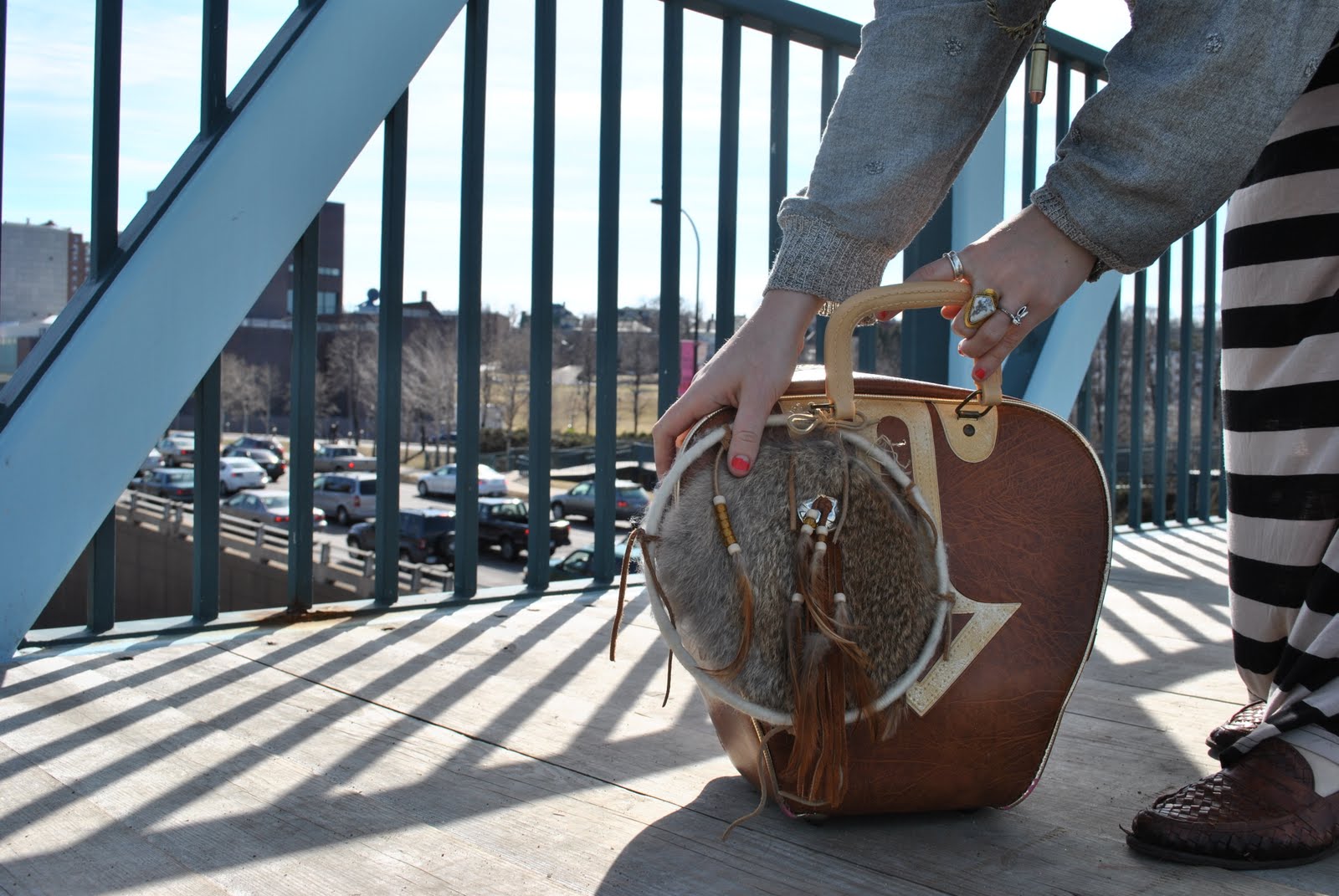
 I had to cut the squirrel into the photo and then I had to clone stamp the ground to make it blend in and remain focused. I purpsely positioned it so that her hand is on its ear and the squirrel looks bigger than her.


 The first one is vintage. I put a yellow color by adding a filter to the photo, and i adjusted the colors using curves. The second one is the grainy one. I added a smart filter and then used the noise filter. It is suttle but makes a difference. The last one is the high contrast. I adjusted the vibrance and hue & saturation and also used the curves. I like the vintage and high contrast ones the best. The grainy one just looks bad to me.


